With the sun making more of an appearance lately I have been keen to make the most of the beautiful weather. I have discovered a new love for my garden and finally got round to putting in flower beds making it look less like a small football pitch and more like a proper ‘grown up’s’ garden . . . it’s only taken me 20 years! As I took these newfound green fingers of mine round the garden centre last weekend, I noticed how busy the shops and streets are getting. I guess partly due to the glorious weather, but also with the ease of lockdown and people feeling more confident in getting back out into the world again.
So how can you grab the attention of these fair-weather shoppers? Instead of leisurely strolling past, how do you stop them in their tracks? The answer is simple. External Signage! With the right design, you can have them poised like rabbits in headlights.

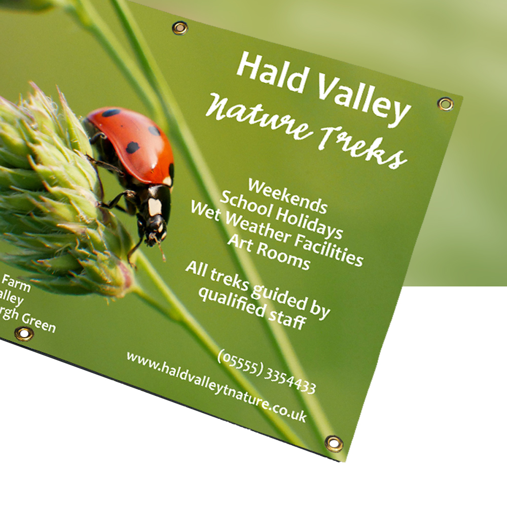
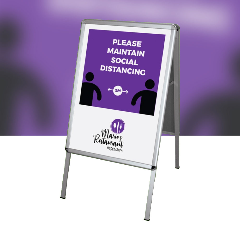
External signage is perfect for getting your message across. It’s a way of shouting about your offers at the top of your voice (in a socially acceptable way) and with the use of bold text, striking images and weatherproof materials you can showcase your business to every passerby, come rain or shine.
Six tips to help you get started . . .
If you have not developed some external signage before, we wanted to share below a couple of best practice tips with you that may help you to get started:
- Size: Ensure the size of the sign is in good proportion to the area where it is being displayed, if it is too small, it could get lost in the crowd and overlooked by passers by.
- Positioning: Before you order, check that you have chosen the best position for your sign to maximise it’s visibility. If you have options maybe consider which location has the greater footfall.
- Fonts: Keep typefaces plain and easy to read. Decorative fonts are nice to look at, but you want your message to be clear. You may wish to consider making the type larger than you may think as we haven’t all got 20/20 vision and a couple of point sizes larger could make all difference for your customers.
- Branding: Use colours that reflect your branding so potential customers can instantly relate the sign to you and your services. For additional colours try to use shades and tones that compliment your brand colours and don’t forget to incorporate your logo, no matter what they are being used for, they are a great advertising tool.
- Call to Action: Use your sign as a means of communication. It is important to include a call to action, such as a phone number and/ or website address. If you are tight on space incorporating a QR code may be the answer, this enables people to scan it with their smart phones and they are instantly taken to your website or social media links.
- Dates: If you are planning to use a date on your sign, for an event or a promotion for example, consider if the date is actually necessary. What if an event date changes? Or you wish to extend a promotion? Once you have a dated fixed on the sign it makes it redundant if the situation changes. It also stops you from being able to reuse that sign at a later date.
We can provide many different types of external signage including: cafe barriers, pavement swing boards, A-frames, vinyl banners, flag banners and so much more. We can even offer signage solutions with interchangeable graphics so you can easily, and cost-effectively, update your message or rotate your displays keeping your signs fresh and exciting.

There are lots of different external signage options out there, with so much choice it can be confusing. Why not get in touch next time you wish to review your external signage and let us guide you through the choices to find the right solution for your brief.
